

2015 Auto3000 cars
+2
Dexter249
Mother of Invention
6 posters
Page 1 of 1

2015 Auto3000 cars
![]() by Milan655 Fri May 01, 2015 1:38 pm
by Milan655 Fri May 01, 2015 1:38 pm
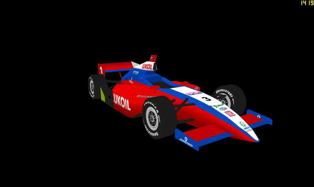
Scuderia Modena
#1 Giancarlo Petrucci - Pagine Gialle
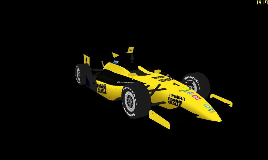
#2 Christian Andersson - GAV
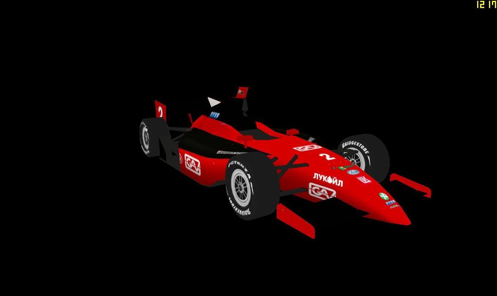
#3 Vitaly Zlobin - Lukoil
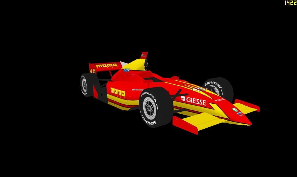
Imola Racing Team
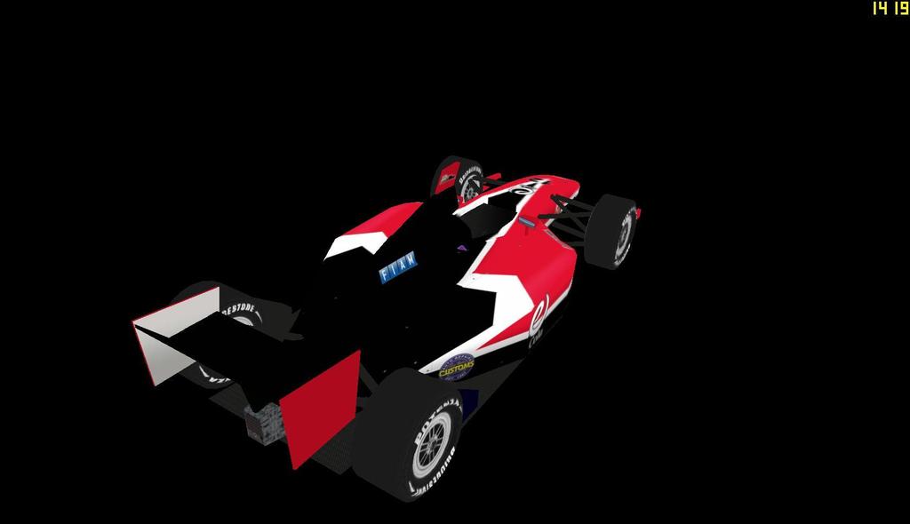
#15 Stefano Spoldi - MOMO
#1 Giancarlo Petrucci - Pagine Gialle

#2 Christian Andersson - GAV

#3 Vitaly Zlobin - Lukoil

Imola Racing Team
#15 Stefano Spoldi - MOMO


Milan655- Legend

- Posts : 2352
Join date : 2011-09-04
Age : 33
Location : London, UK/Bangkok, Thailand
Re: 2015 Auto3000 cars
![]() by Mother of Invention Sun May 03, 2015 10:49 am
by Mother of Invention Sun May 03, 2015 10:49 am
Can never go wrong with a Momo car. 

Mother of Invention- Legend
- Posts : 2511
Join date : 2011-08-08
Re: 2015 Auto3000 cars
![]() by Milan655 Sun May 03, 2015 2:23 pm
by Milan655 Sun May 03, 2015 2:23 pm
Logo:

Balkan Motorsports
#12-14 all look the same, so only posting one:


Balkan Motorsports
#12-14 all look the same, so only posting one:


Milan655- Legend
- Posts : 2352
Join date : 2011-09-04
Age : 33
Location : London, UK/Bangkok, Thailand
Re: 2015 Auto3000 cars
![]() by Dexter249 Sun May 03, 2015 4:58 pm
by Dexter249 Sun May 03, 2015 4:58 pm
thanks milan for the cars the black and red contrast works really good
Dexter249- First-Time Winner

- Posts : 330
Join date : 2015-04-13
Age : 21
Location : Ottawa, Ontario, Canada, North America,Earth,Sol,Alpha Quadrant, Milky Way, Universe
Re: 2015 Auto3000 cars
![]() by Milan655 Wed May 13, 2015 9:57 am
by Milan655 Wed May 13, 2015 9:57 am
Shining Knight Autosport
#7 Jonathon Knight


#71 Regina McCloud
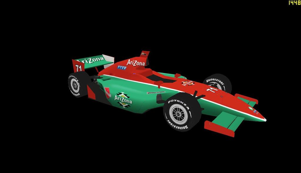

#7 Jonathon Knight


#71 Regina McCloud


Milan655- Legend
- Posts : 2352
Join date : 2011-09-04
Age : 33
Location : London, UK/Bangkok, Thailand
Re: 2015 Auto3000 cars
![]() by Cynon Thu May 14, 2015 7:31 pm
by Cynon Thu May 14, 2015 7:31 pm
Leaving the logo I made for F5 on there? Nice. 
The trick to painting on the Indycar 1.1 body is that you have to use space well. Logos that are short but wide (like the AriZona logo on the sidepod of the 7 car) work very well on the sidepods, whereas logos that are tall and narrow (like the eCola one on the 12 car) look awkward usually.
My personal favorites are the 3 and the 15. What I also have noticed from painting on this model is that if you know how to make use of the space you have, it doesn't look bad or cluttered -- no matter how many logos there are on the car. You clearly grasp the concept of making logos wider the further up the nose you go and how nice those can look.
I sent this as an example car to Snake to illustrate my point. Feel free to stick this in carviewer. Just don't steal my helmet design or I will throw a hissy fit for 10 whole seconds (this is one of my league cars)
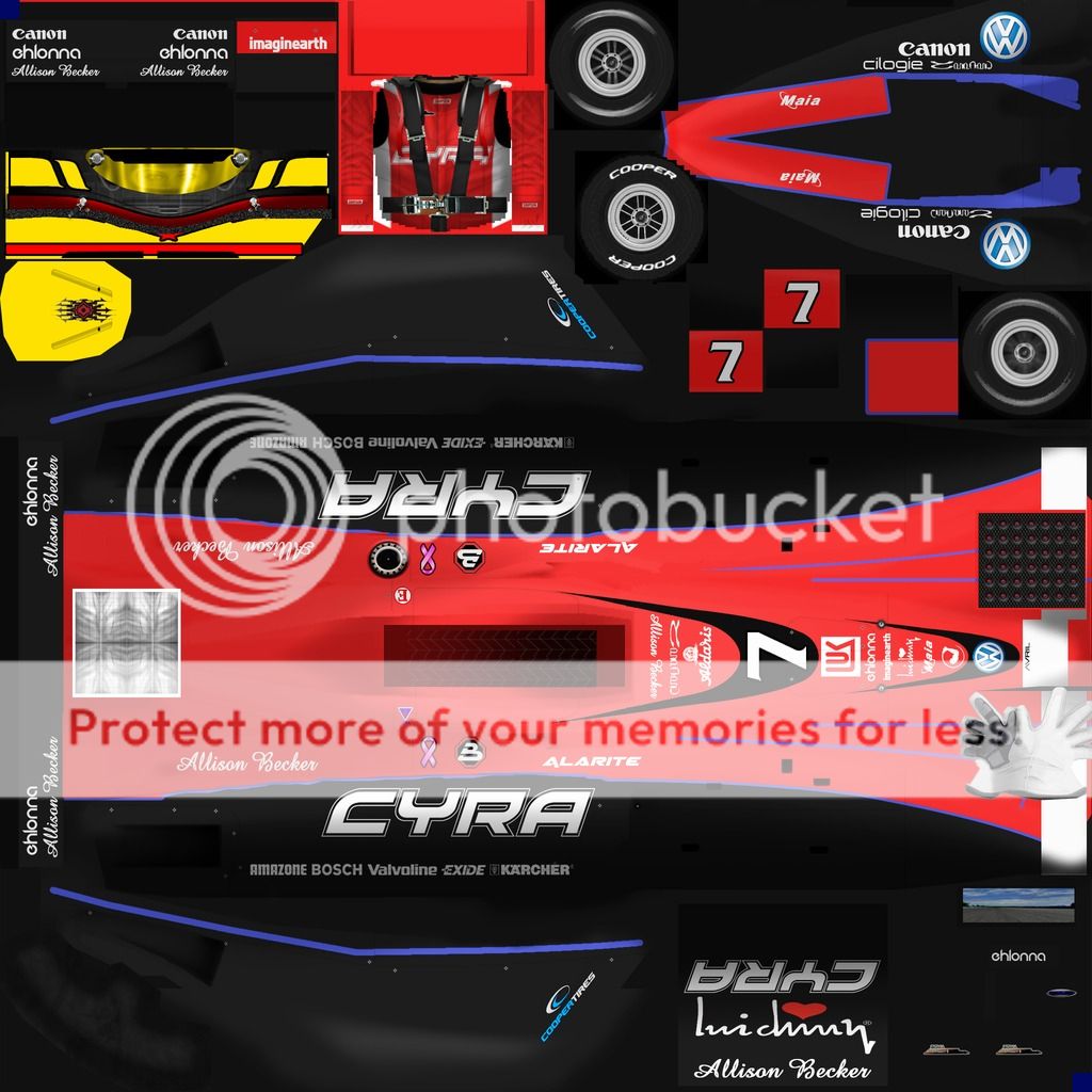
IMO a really good car always has a place for your eyes to rest on.
The trick to painting on the Indycar 1.1 body is that you have to use space well. Logos that are short but wide (like the AriZona logo on the sidepod of the 7 car) work very well on the sidepods, whereas logos that are tall and narrow (like the eCola one on the 12 car) look awkward usually.
My personal favorites are the 3 and the 15. What I also have noticed from painting on this model is that if you know how to make use of the space you have, it doesn't look bad or cluttered -- no matter how many logos there are on the car. You clearly grasp the concept of making logos wider the further up the nose you go and how nice those can look.
I sent this as an example car to Snake to illustrate my point. Feel free to stick this in carviewer. Just don't steal my helmet design or I will throw a hissy fit for 10 whole seconds (this is one of my league cars)
IMO a really good car always has a place for your eyes to rest on.
_________________
no
Online Wins: 27
Last Win: ARSS @ Papyrus 2
Nintendo ID (Wii U only): Cyriaan
Catbag wrote:If there were no insanity, it would be necessary to invent it.
Anon wrote:Yeah, but what if Ann Coulter tried bath salts?

Cynon- Admin
- Posts : 3339
Join date : 2011-08-05
Age : 35
Location : Chicago, Illinois -

Re: 2015 Auto3000 cars
![]() by Milan655 Sun May 17, 2015 11:38 am
by Milan655 Sun May 17, 2015 11:38 am
Thanks for the help Cy, will try and sort out the current painted cars with your advice 
Milan655- Legend
- Posts : 2352
Join date : 2011-09-04
Age : 33
Location : London, UK/Bangkok, Thailand
Re: 2015 Auto3000 cars
![]() by Milan655 Thu Jun 04, 2015 3:51 pm
by Milan655 Thu Jun 04, 2015 3:51 pm
Mackintosh Motor Sport
#11 Stellamarie Vincent-Smith

#44 Mike Hutchins

#77 Micah Mitchell

Turn1 Motorsport
Just noticed numbers are wrong way around and will switch them over.
#008 Niki Inago

#4 Ralph Jefferson


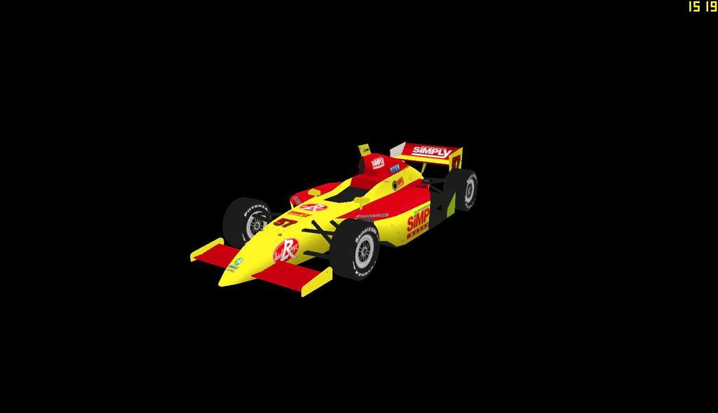
Autosport Rochambeau
#57 Cedric Vernet
#11 Stellamarie Vincent-Smith

#44 Mike Hutchins

#77 Micah Mitchell

Turn1 Motorsport
Just noticed numbers are wrong way around and will switch them over.
#008 Niki Inago

#4 Ralph Jefferson


Autosport Rochambeau
#57 Cedric Vernet

Milan655- Legend
- Posts : 2352
Join date : 2011-09-04
Age : 33
Location : London, UK/Bangkok, Thailand
V8fan12- First-Time Winner
- Posts : 281
Join date : 2014-05-06
Age : 26
Location : Auckland, New Zealand
Re: 2015 Auto3000 cars
![]() by SpeedDemon37 Fri Jun 05, 2015 1:28 pm
by SpeedDemon37 Fri Jun 05, 2015 1:28 pm
The #57 looks great, I love the red-to-yellow ratio and the logo placement! Thanks for painting it! 

SpeedDemon37- Champion
- Posts : 1791
Join date : 2012-05-11
Age : 26
Location : Michigan, USA
» 2015 FARC Elite Series Cars
» Some 2015 FARC Cars
» A few 2015 EuroV8 cars
» 2015 NPCC PSI cars
» 2015 FARC Elite Series cars
» Some 2015 FARC Cars
» A few 2015 EuroV8 cars
» 2015 NPCC PSI cars
» 2015 FARC Elite Series cars
Page 1 of 1
Permissions in this forum:
You cannot reply to topics in this forum|
|
|